In this post we will see how to use custom styles in Spec applications. We will start to present styles and then build a little editor as the one displayed hereafter.
We will show that an application in Spec manages styles and let you adapt the look of a presenter.
How do styles work?
Styles in Spec work like CSS. They are style sheets in which the properties for presenting a presenter are defined. Properties such as colors, width, height, font, and others. As a general principle it is better to use styles instead of fixed constraints, because your application will be more responsive.
For example, you want a button to have a specific width and height. You can do it using constraints with the method add:withConstraints: or using styles. In both cases the result will be this:

But, if you change the size of the fonts of the Pharo image using Settings/Appearance/Standard Fonts/Huge, using fixed constraints, you will obtain the following result. You will for example do not be able to see the icons because the size is not recomputed correctly.

If you use styles, the size of the button will also scale as shown below.
Style format
The styles in Spec format are similar to CSS. Style style sheets are written using STON as format. We need to write the styles as a string and then parse it as a STON file.
Here is an example that we will explain steps by steps below.
'.application [
    .lightGreen [ Draw { #color: #B3E6B5 } ],
    .lightBlue [ Draw { #color: #lightBlue } ] ]'
We will go by steps.
SpPropertyStyle has 5 subclasses: SpContainerStyle, SpDrawStyle, SpFontStyle, SpTextStyle, and SpGeometryStyle. These subclasses define the 5 types of properties that exist. On the class side, the method stonName that indicates the name that we must put in the STON file.
SpDrawStylemodifies the properties related to the drawing of the presenter, such as the color and the background color.SpFontStylemanipulates all related to fonts.SpGeometryStyleis for sizes, like width, height, minimum height, etc.SpContainerStyleis for the alignment of the presenters, usually with property is changed on the main presenter, which is the one that contains and arranges the other ones.SpTextStylecontrols the properties of theSpTextInputFieldPresenter.
If we want to change the color of a presenter, we need to create a string and use the SpDrawStyle property, which STON name is Draw as shown below. For setting the color, we can use either the hexadecimal code of the color or the sender of Color class.
'.application [
    .lightGreen [ Draw { #color: #B3E6B5 } ],
    .lightBlue [ Draw { #color: #lightBlue } ] ]'
Now we have two styles: lightGreen and lightBlue that can be applied to any presenter.
We can also use environmental variables to get the values of the predefined colors of the current theme, or the fonts. For example, we can create two styles for changing the fonts of the letters of a presenter:
'.application [
    .codeFont [ Font { #name: EnvironmentFont(#code) } ],
    .textFont [ Font { #name: EnvironmentFont(#default) } ]
]'
Also we can change the styles for all the presenters by default. We can put by default all the letters in bold.
'.application [
	Font { #bold: true }
]'
Defining an Application
To use styles we need to associate the main presenter with an application. The class SpApplication already has default styles. To not redefine all the properties for all the presenters, we can concatenate the default styles (SpStyle defaultStyleSheet) with our own. As said above, the styles are actually STON files that need to be parsed. To parse the string into a STON we can use the class SpStyleVariableSTONReader.
presenter := SpPresenter new.
presenter application: (app := SpApplication new).

styleSheet := SpStyle defaultStyleSheet,
	(SpStyleVariableSTONReader fromString:
	'.application [
	     Font { #bold: true },
            .lightGreen [ Draw { #color: #B3E6B5 } ],
            .bgBlack [ Draw { #backgroundColor: #black } ],
	    .blue [ Draw { #color: #blue } ]
]' ).

app styleSheet: styleSheet.
Now, can can add one or more styles to a presenter, like follows:
presenter layout: (SpBoxLayout newTopToBottom
	add: (label := presenter newLabel);
	yourself).

label label: 'I am a label'.
label addStyle: 'lightGreen'.
label addStyle: 'black'.

presenter openWithSpec.
Also we can remove and add styles at runtime.
label removeStyle: 'lightGreen'.
label removeStyle: 'bgBlack'.
label addStyle: 'blue'.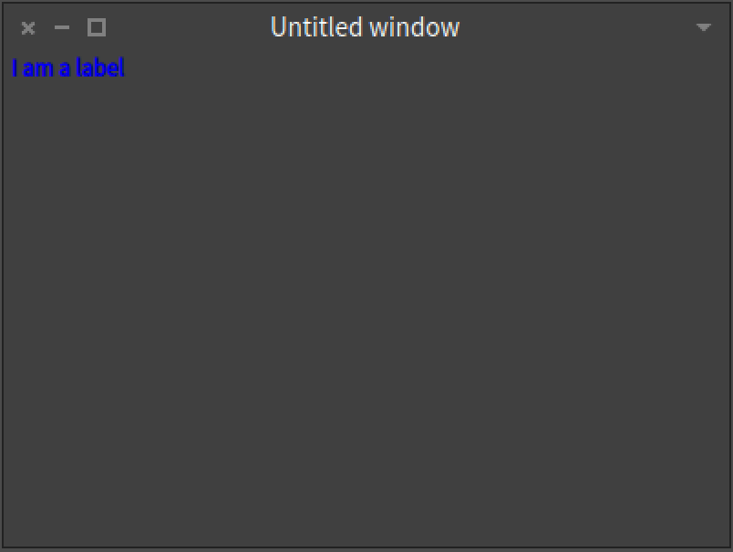
Using classes
To properly use styles, it is better to define a custom application as a subclass of SpApplication.
SpApplication << #CustomStylesApplication
	slots: {};
	package: 'Spec-workshop'
In the class we need to override the method styleSheet to return our custom style sheet concatenated with the default one.
CustomStylesApplication >> styleSheet

	^ SpStyle defaultStyleSheet,
	(SpStyleVariableSTONReader fromString:
'.application [
	Font { #bold: true },

	.lightGreen [ Draw { #color: #B3E6B5 } ],
	.lightBlue [ Draw { #color: #lightBlue } ],
	.container [ Container { #padding: 4, #borderWidth: 2 } ],
	.bgOpaque [ Draw { #backgroundColor: EnvironmentColor(#base) } ],
	.codeFont [ Font { #name: EnvironmentFont(#code) } ],
	.textFont [ Font { #name: EnvironmentFont(#default) } ],
	.bigFontSize [ Font { #size: 20 } ],
	.smallFontSize [ Font { #size: 14 } ],
	.icon [ Geometry { #width: 30 } ],
	.buttonStyle [ Geometry { #width: 110 } ],
	.labelStyle [
		Geometry { #height: 25 },
		Font { #size: 12 }	]
]')
We can use different properties in the same style. For example, in labelStyle we are setting the height of the presenter to 25 scaled pixels and the font size to 12 scaled pixels. Also, we are using EnvironmentColor(#base)for obtaining the default background colour according to the current theme. Because the colour will change according to the theme that used in the image.
For the main presenter, we will build a mini-text-viewer in which we will be able to change the size and the font of the text that we are viewing.
SpPresenter << #CustomStylesPresenter
	slots: { #text . #label . #zoomOutButton . #textFontButton . #codeFontButton . #zoomInButton };
	package: 'Spec-workshop'
In the initializePresenters method we will first initialise the presenters, then set the styles for the presenters and finally initialise the layout.
CustomStylesPresenter >> initializePresenters

	self instantiatePresenters.
	self initializeStyles.
	self initializeLayout
CustomStylesPresenter >> instantiatePresenters
zoomInButton := self newButton.
zoomInButton icon: (self iconNamed: #glamorousZoomIn).
zoomOutButton := self newButton.
zoomOutButton icon: (self iconNamed: #glamorousZoomOut).
codeFontButton := self newButton.
codeFontButton
icon: (self iconNamed: #smallObjects);
label: 'Code font'.
textFontButton := self newButton.
textFontButton
icon: (self iconNamed: #smallFonts);
label: 'Text font'.
text := self newText.
text
beNotEditable
clearSelection;
text: String loremIpsum.
label := self newLabel.
label label: 'Lorem ipsum'CustomStylesPresenter >> initializeLayout
self layout: (SpBoxLayout newTopToBottom
add: label expand: false;
add: (SpBoxLayout newLeftToRight
add: textFontButton expand: false;
add: codeFontButton expand: false;
addLast: zoomOutButton expand: false;
addLast: zoomInButton expand: false;
yourself)
expand: false;
add: text;
yourself)Finally, we change the window title and size:
CustomStylesPresenter>> initializeWindow: aWindowPresenter

	aWindowPresenter
		title: 'Using styles';
		initialExtent: 600 @ 400
Without setting the custom styles nor using our custom application in the presenter, we have:
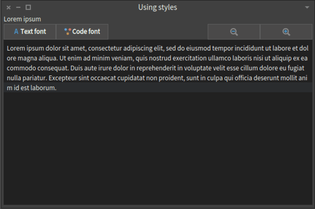
We do not want the black background color for the text presenter. We will like to have a sort of muti-line label. We want the zoom buton to be smaller as they only have icons. We want to have the option to change the size and font of the text inside the text presenter. Finally, why not, we want to change the color of the label, change the height and make it a little more bigger.
CustomStylesPresenter >> initializeStyles

    "Change the height and size of the label."
    label addStyle: 'labelStyle'.
    "But the color as light green"
    label addStyle: 'lightGreen'.

    "The default font of the text will be the code font and the size size will be the small one."
    text addStyle: 'codeFont'.
    text addStyle: 'smallFontSize'.
    "Change the background color."

    text addStyle: 'bgOpaque'.

    "But a smaller width for the zoom buttons"
    zoomInButton addStyle: 'icon'.
    zoomOutButton addStyle: 'icon'.

    codeFontButton addStyle: 'buttonStyle'.
    textFontButton addStyle: 'buttonStyle'.

    "As this presenter is the container, set to self the container
    style to add a padding and border width."

    self addStyle: 'container'
Finally, we have to override the start method in the application. With this, we are going to set the application of the presenter and run the presenter from the application.
CustomStylesApplication >> start

	(self new: CustomStylesPresenter) openWithSpec
Now, if we run CustomStylesApplication new start we will have:
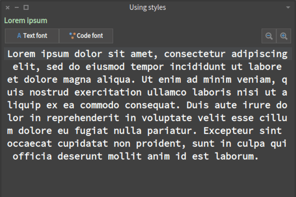
The only thing missing is to add the behaviour when pressing the buttons.
For example, if we click on the zoom in button we want to remove the smallFontStyle and add the bigFontSize. Or, if we click on the text font button, we want to remove the style codeFont and add the textFont style. So, in the connectPresenters method we have:
CustomStylesPresenter >> connectPresenters
zoomInButton action: [
text removeStyle: 'smallFontSize'.
text addStyle: 'bigFontSize' ].
zoomOutButton action: [
text removeStyle: 'bigFontSize'.
text addStyle: 'smallFontSize'].
codeFontButton action: [
text removeStyle: 'textFont'.
text addStyle: 'codeFont' ].
textFontButton action: [
text removeStyle: 'codeFont'.
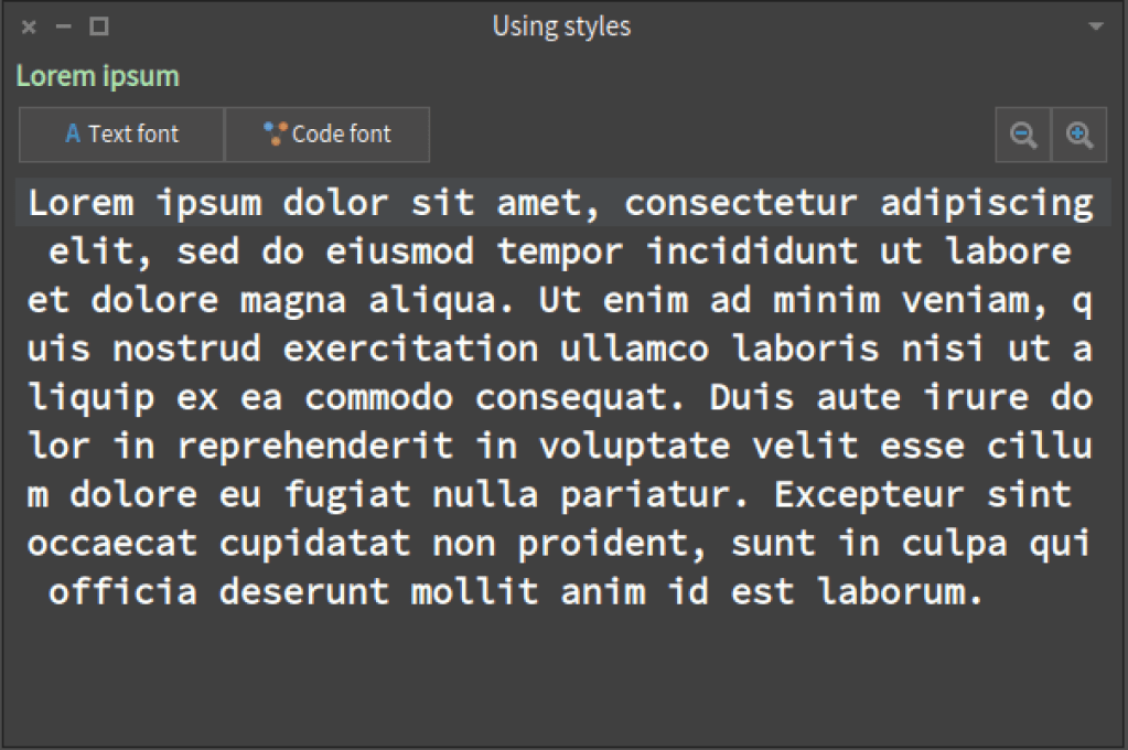
text addStyle: 'textFont']Now, if we click on zoom in we will have:
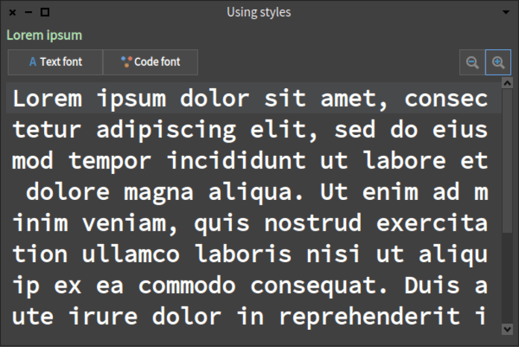
And if we click on text font:

Conclusion
Using styles in Spec is great. It make easier to have a consistent design as we can add the same style to several presenters. If we want to change some style, we only edit the styles sheet. Also, the styles automatically scale if we change the font size of all the image. They are one of the main reason why in Spec we have the notion of an application. We can dynamically change how a presenter looks.
Sebastian Jordan-Montano
 The Pharo Dev: Mastering Objects